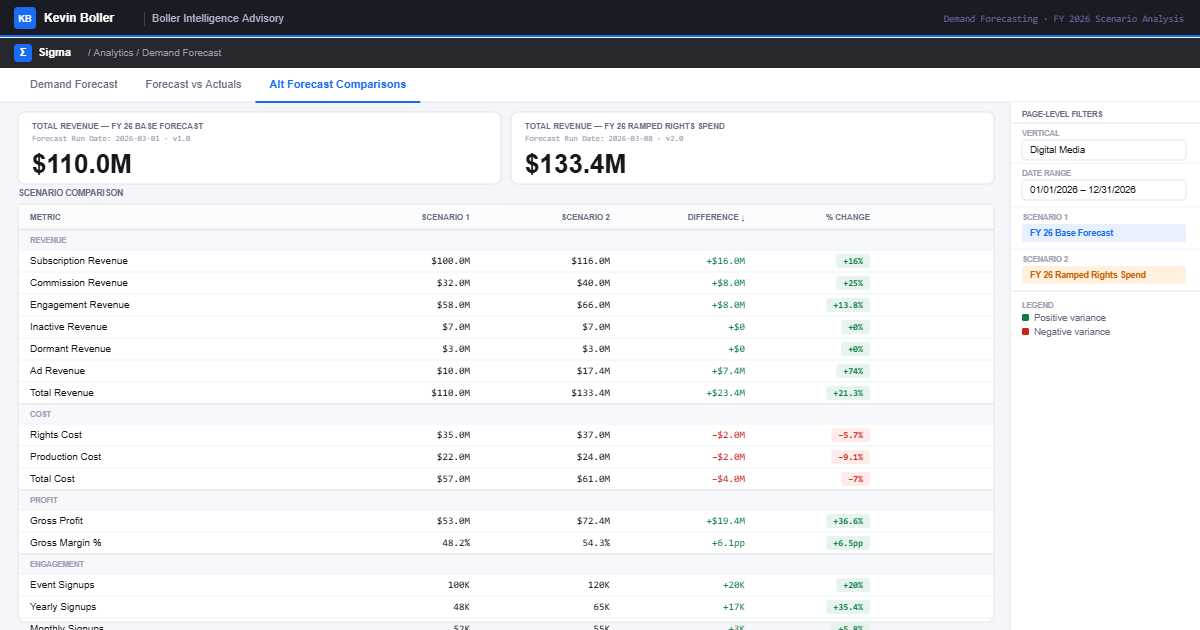
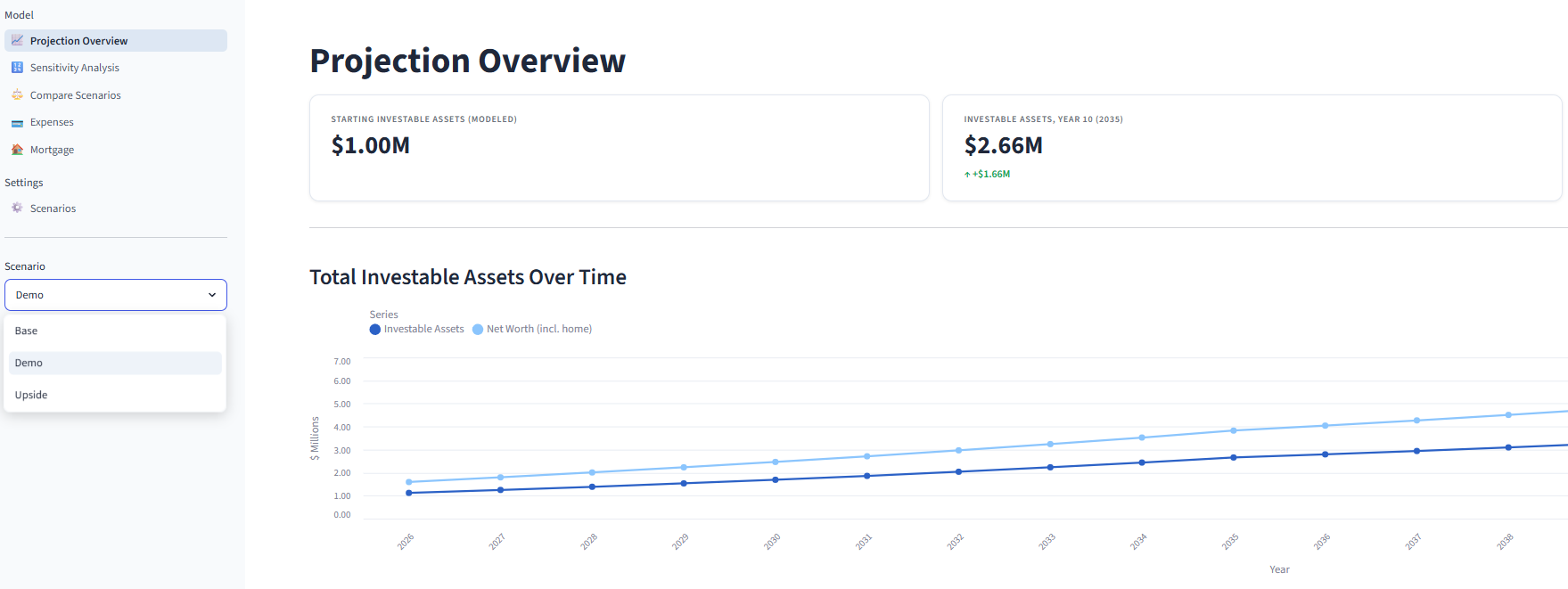
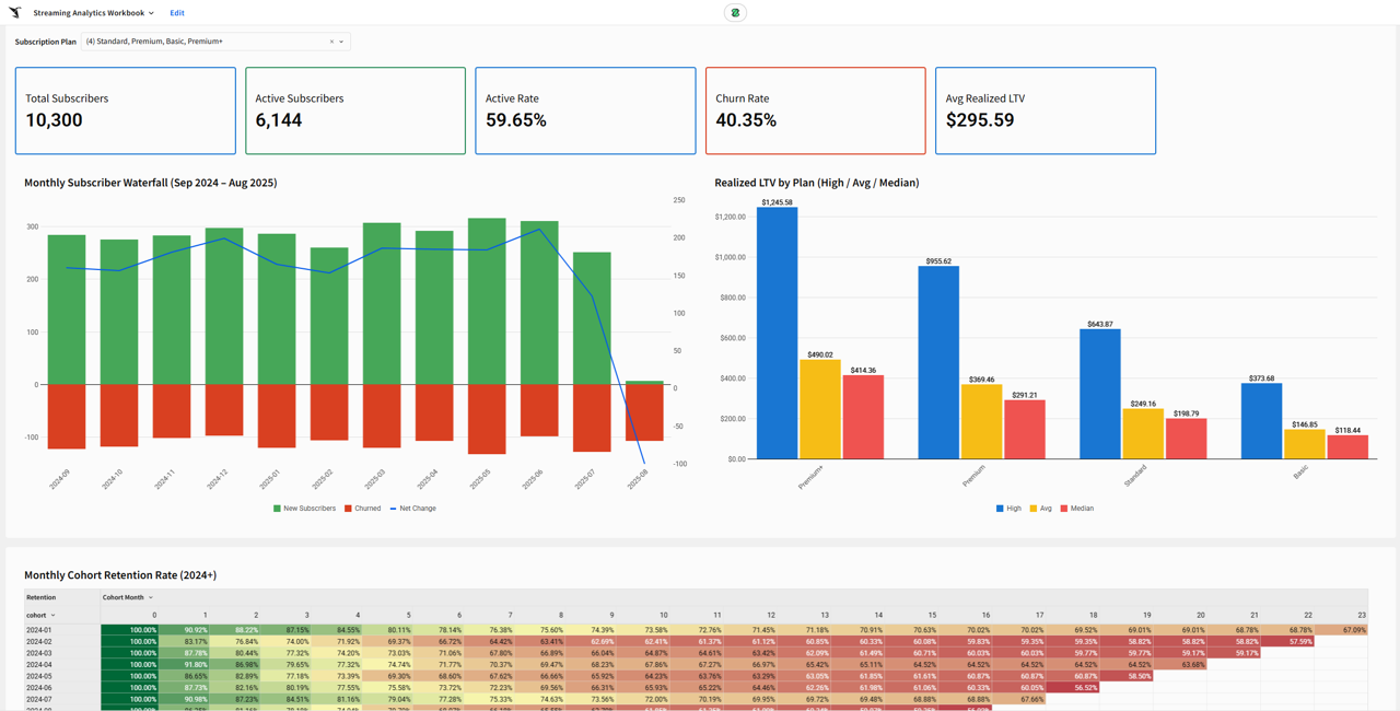
Note: diagrams for the economic model and the structural workflow for the Super App can be found in the Appendix.
As covered in part 1 of this series, the jagged frontier for live sports exists for the following reasons:
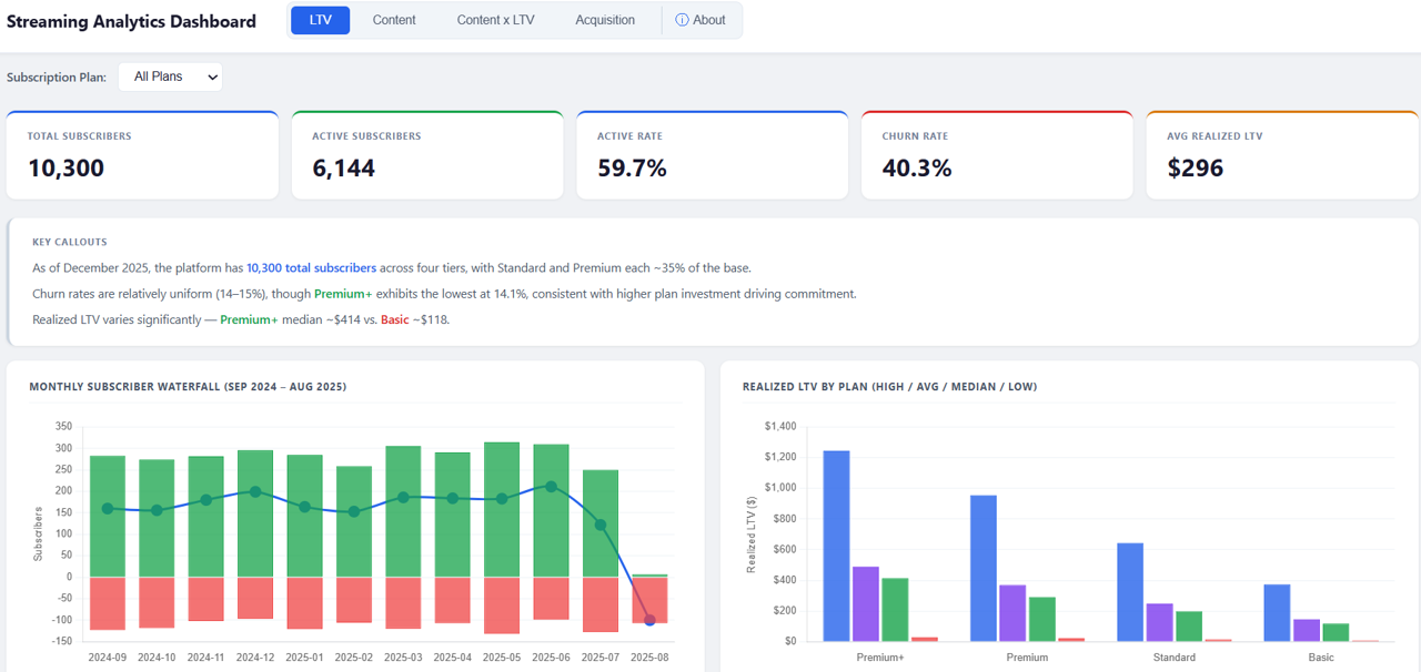
Economics: advertising only/advertising mostly or subscription only/subscription mostly business models are likely not the path to profitable longevity, Discovery: customer discovery remains a challenge, even when leagues are available on the largest TV platforms out there, including Roku and Samsung, Fragmentation: a customer pain point for every league, from the NFL and NBA down to college sports and below, Customer retention: for subscription-based services, churn is an ever-present challenge, that arguably becomes more and more challenging as the proliferation of customer options continues, and Engagement share: Competition for engagement and time spent, when you’re competing against behemoths like Netflix, YouTube, and Meta, has never been more challenging and will only get more competitive. Recent Industry Announcements Versant Sports Portfolio: Versant, the Comcast cable network spinoff that began trading independently in January 2026, announced in November 2025 that “USA Sports” would be the unified brand and division name for its sports portfolio across USA Network, Golf Channel, and CNBC. The portfolio includes NASCAR, PGA Tour, Premier League, WWE, WNBA, USGA, LPGA Tour, and League One Volleyball (LOVB), totaling more than 10,000 hours of sports programming in 2026, approximately 1,000 of which are dedicated to women’s sports.
...