Scaling Analytical Insights with Python (Part 1)

In recent months, I’ve written about some of the critical undertakings and initiatives which I oversee as VP of Product at FloSports. These have included my efforts to build a data informed culture through product experimentation, our overall approach to our analytics tech stack, and our approach to building and reviewing our rolling financial forecasts.
I’ve also mentioned that the implementation of our data warehouse and the use of data analytics software, including Periscope Data, Segment, and Mode Analytics, have been fairly transformative across the company. And, as business intelligence and data analysis requests and feedback grow within an organization, it is critical to put processes and analytical procedures in place that reduce the queuing of data requests -- fast-paced and efficient approaches significantly reduce the time gathering the data and increase the level of insight derived from the data.
In other words, spend less time calculating your LTV and more time focusing on efforts to grow your LTV.
Here's what I will cover in this three part post series:
- Part 1. Cohort retention analysis in Python; I discovered this over a year ago on Greg Reda’s blog, and it was remarkably helpful
- Taking this an additional step further and calculating weighted average retention for monthly cohorts
- This can then become a single series fed directly into a financial model
- Part 2. The power of Mode Analytics, which combines SQL and Python into a single web application
- Outside of Mode, I use Jupyter Notebook for all analysis in Python
- Mode Analytics has a powerful offering for Python, which is completely self-contained within their overall reporting application
- Part 3. The use of Python, in place of Excel, to conduct large scale financial and operational analysis; the analysis / dataframes can ultimately, as the last step, be pasted into a financial model
- The best resource I’ve found for Python business application to-date is Chris Moffit’s Practical Business Python blog
Cohort Retention Analysis with Python
Rather than reconstruct Greg Reda’s remarkably helpful post, which can be found here, I will simply continue from where he leaves off by showing how to calculate M1, M2, etc. weighted average retention.
As mentioned in this guest post on Andrew Chen’s blog, Christoph Janz has written some of the most helpful essays on SaaS metrics and cohort analyses. One of the screenshots in Christoph’s guest post, from his model, shows the calculated weighted average retention by cohort month.
Here’s a screenshot from that guest post of what this looks like (note the fifth footnote):
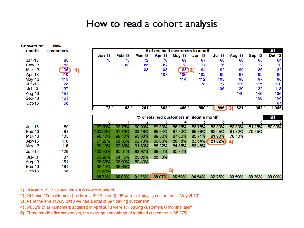
I certainly believe Christoph's model and overall helpfulness to SaaS companies is fairly outstanding. However, as a company scales, there are challenges with activities such as pasting cohort data into a model and then calculating weighted average retention, and other metrics, within Excel.
At FloSports, I am constantly thinking about and looking to create scaleable solutions to deal with some of the challenges which we've run into as our data sources and volume of data increases. Some examples of these challenges which I must always consider include:
- We have 25+ verticals with multiple subscription offerings for each.
- New data is constantly being generated by subscribers, including experimentation data, and we need to be able to quickly evaluate all of this multiple ways in order to "cut our losers quickly and let our winners run."
- Our verticals are at different stages within their lifecycles, and building and updating flexible subscriber waterfalls in Excel, as one example, can be rather time consuming.
Calculating Weighted Average Subscriber Retention with Python
If you would like to follow along with this explanation in Jupyter notebook, you will just need to use Greg Reda’s code from his post (here's the link again), in order to arrive at my starting point -- I’m starting after his last code snippet, which uses Seaborn and generates a heat map.
In his post, Greg used the unstack method in order to create a matrix where each column is the Cohort Group and each row is the Cohort Period. Using this unstack approach and then resetting the index, we have a flattened dataframe which we can now manipulate in order to calculate the weighted average retention by Cohort Period, e.g., Month 1. Below the code block is what the output for this dataframe looks like in Jupyter Notebook.
# Unstack the TotalUsers
unstacked = cohorts['TotalUsers'].unstack(0)
unstacked.reset_index()
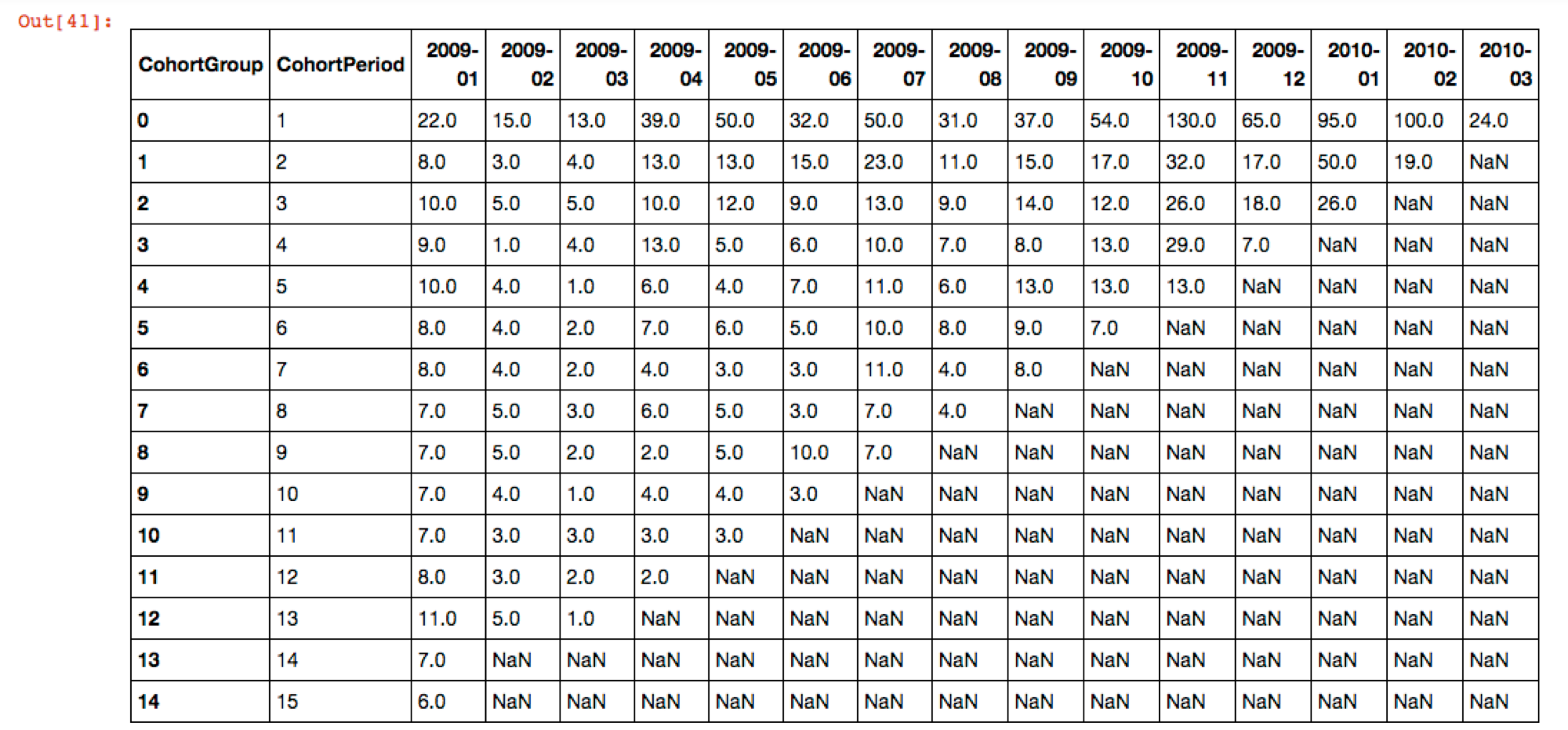
We have successfully manipulated our subscriber data in order to create Cohort Groups and Cohort Periods for those groups, in large part thanks to Greg; and now we can create a separate dataframe which will contain our weighted average retentions across these combined cohorts for each of their monthly periods for which we have data.
There is a fair amount going on below, and I can certainly clarify or provide more detail as needed. We create a dataframe with a reset index to isolate the data we need. We then write two functions -- the first finds the number of columns we should use for each weighted average period, and the second is used to divide the total subs left after i periods by the appropriate amount of initial Total Subs. After that, we use the filter method and then utilize Plotly in order to make an interactive chart right within the Jupyter notebook.
# Create a weighted data frame and reset the index
weighted = unstacked.reset_index()

# Add a Total Subs column which sums up all of the subscribers within each Cohort Period.
weighted['Total_Subs'] = weighted.drop('CohortPeriod', axis=1).sum(axis=1)

# Return the full weighted data frame
# weighted

# Count non-NaN values in the row, call n
# Add up first n values of the first row, n_sum
# Divide the value in the total subs column of that row by n_sum
weighted['num_months'] = weighted['CohortPeriod'].count() - weighted.isnull().sum(axis=1)

def calc_sum(col_end):
    ans = 0
    for i in range(1,int(col_end)):
        ans = ans + weighted.iloc[0, i]

    return ans

def calc_ret_pct(total_subs, num_months):
    sum_initial = calc_sum(1 + num_months)

    return total_subs / sum_initial

# Create a retention percentage column with use of a lambda function to apply calc ret pct for each row
weighted['Ret_Pct'] = weighted.apply(lambda row: calc_ret_pct(row['Total_Subs'], row['num_months']), axis=1)
# weighted

# Grab only the Cohort Period and Ret Pct columns
weighted_avg = weighted.filter(items=['CohortPeriod', 'Ret_Pct'])

weighted_avg['Ret_Pct'] = pd.Series(["{0:.2f}%".format(val * 100) for val in weighted_avg['Ret_Pct']], index = weighted_avg.index)
weighted_avg['CohortPeriod'] = weighted_avg['CohortPeriod'].astype(int)

# Transpose the values to run across the row rather that column
weighted_avg_transpose = weighted_avg.transpose()

# Return the weighted average data frame
# weighted_avg
# Import necessary libraries in order to plot weighted average retention using Plotly
import plotly.plotly as py
from plotly.offline import download_plotlyjs, init_notebook_mode, iplot
from plotly.graph_objs import *
import plotly.graph_objs as go
import plotly
plotly.offline.init_notebook_mode()

trace = go.Scatter(
    x = weighted_avg['CohortPeriod'],
    y = weighted_avg['Ret_Pct']
)

data = [trace]

layout = go.Layout(
    title = 'Monthly Retention Curve',
    yaxis=dict(
        ticksuffix='%'
    )
)

fig = dict(data=data, layout=layout)

iplot(fig)
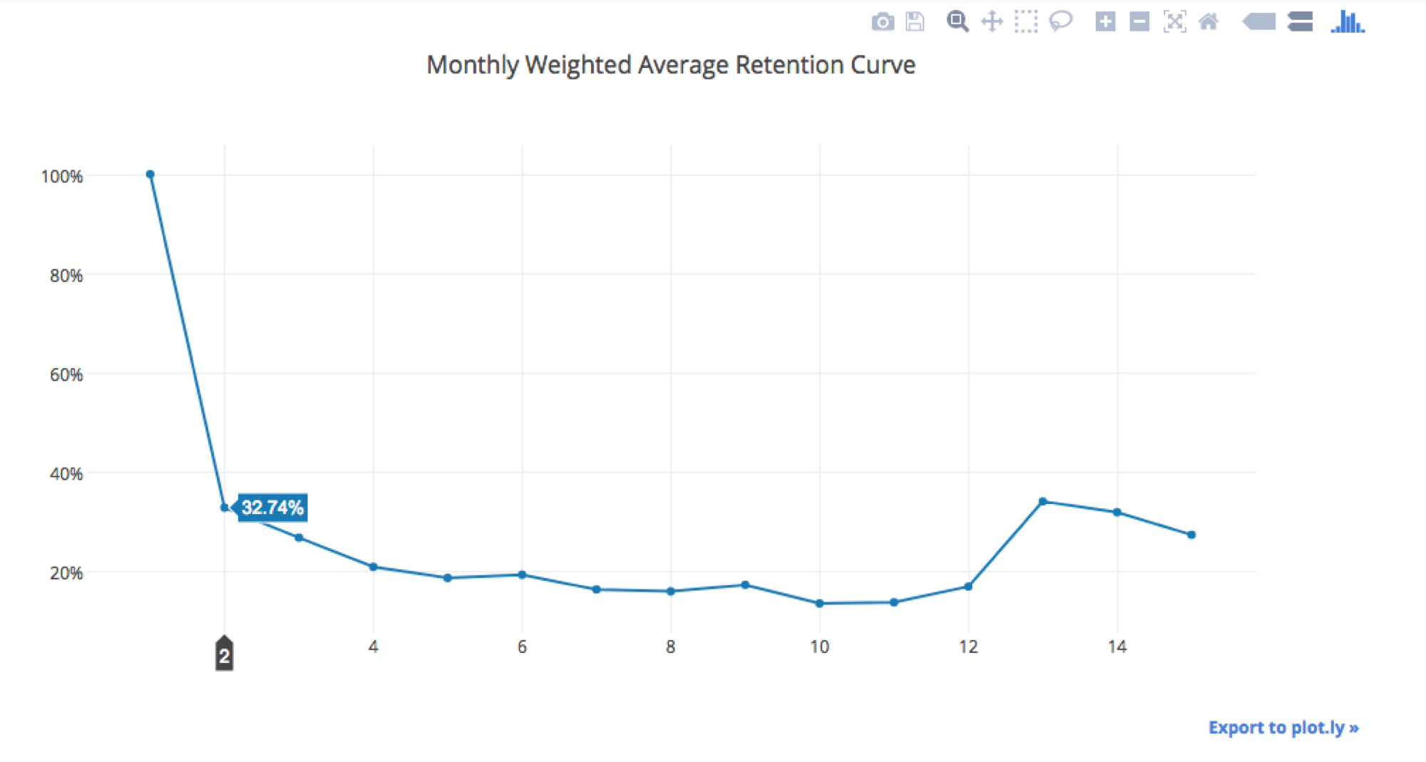
Across all of the Cohorts in the data set that Greg originally used, we had 757 total users. As you can see from the data above, in the month after their initial purchase, ~33% (hovered over in the chart above) were retained in the second month -- at FloSports, we would call this M1 retention since M0 is the initial payment month.
As you might imagine, this is a massive time saver and is much easier to check for mistakes and therefore much less error-prone than a traditional excel-based approach, particularly when you need to update, e.g., each month / as new experiment data rolls in.
In the financial models which I build and collaborate on, we include a retention curve schedule worksheet, which we dynamically select based on the business case / vertical running through the model's different scenarios (pricing, offerings, et al). We do this in order to be able to conduct all sorts of pro forma analyses and this schedule worksheet could have 10 - 20 different retention curves at a time. Adding a new selection to our models can now be as simple as re-running the above analysis, after reading in the source data, and then reading out the data and pasting that weighted average retention series into your model's worksheet.
Hopefully I have made the time savings Python affords in acquiring the data to be pasted into these retention curve worksheets to seem rather compelling. I have found the scaleability of doing analysis such as this in Python, a language I'm continually trying to improve in, to be fairly remarkable.
My general approach is to use a data gathering language, SQL in my case, and gather data for specific date ranges and /or combinations of plan offerings for our subscribers; we then cut our curves as it makes most sense for the business(es) we are evaluating. To achieve this flexibility within Excel is remarkably difficult, if not impossible, and continuing to find ways to scale within Python has been extremely eye opening.
In Part 2 of this Series, I'll discuss the use of this approach within Mode Analytics, which I believe offers even more potential for massive efficiency improvements and gains from increased data insights.