Scaling Financial Insights with Python

My two most recent blog posts were about Scaling Analytical Insights with Python; part 1 can be found here and part 2 can be found here. It has been several months since I wrote those, largely due to the fact that I relocated my family to Seattle to join Amazon in November; I’ve spent most of the time on my primary project determining our global rollout plan and related business intelligence roadmap.
Prior to my departure at my former company, FloSports, we were in the process of overhauling our analytics reporting across the organization (data, marketing, product et al), and part of this overhaul included our financial reporting. While I left early on in that implementation, over the past several months I’ve continued using Python extensively for financial analyses, particularly pandas. In this post, I will share how I leveraged some very helpful online resources, the Yahoo Finance API (requires a work around and may require a future data source replacement), and Jupyter notebook to largely automate the tracking and benchmarking of a stock portfolio’s performance.
Overview of PME and benchmarking individual stock performance
As a quick background, I have been investing in my own stock portfolio since 2002 and developed a financial model for my portfolio a number of years ago. For years, I would download historical prices and load the data into the financial model – while online brokers calculate realized and unrealized returns, as well as income and dividends, I like to have historical data in the model as I conduct my own analyses to evaluate positions. One view / report which I’ve never found from online brokers and services is a “Public Market Equivalent”-like analysis. In short, the Public Market Equivalent (PME) is a set of analyses used in the private equity industry to compare the performance of a private equity fund relative to an industry benchmark. Much more detail here.
Related, the vast majority of equity portfolio managers are unable to select a portfolio of stocks which outperforms the broader market, e.g., S&P 500, over the long-term (~1 in 20 actively managed domestic funds beat index funds). Even when some individual stocks outperform, the underperformance of others often outweighs the better performing stocks, meaning overall an investor is worse off than simply investing in an index fund. During business school I learned about PME, and I incorporated a conceptually similar analysis into the evaluation of my current public equity holdings. To do this properly, you should measure the timing of investment inflows specific to each portfolio position (holding periods) relative to an S&P 500 equivalent dollar investment over the identical holding period. As an example, if you bought a stock on 6/1/2016 and you still own it, you would want to compare the stock’s return over that period to the return of an equal dollar investment on 6/1/2016 in the S&P 500 (our benchmark example). Among other things, you may find that even if a stock has done relatively well it may still trail the S&P 500’s return over the same time period.
In the past, I downloaded historical price data from Yahoo Finance and used INDEX and MATCH functions in excel to calculate the relative holding period performance of each position versus the S&P 500. While this is an OK way to accomplish this goal, conducting the same using pandas in Jupyter notebook is more scalable and extensible. Whenever you download new data and load into excel, you inevitably need to modify some formulas and validate for errors. Using pandas, adding new calculations, such as a cumulative ROI multiple (which I’ll cover), takes almost no time to implement. And the visualizations, for which I use Plotly, are highly reproducible and much more useful in generating insights.
Disclosure: Nothing in this post should be considered investment advice. Past performance is not necessarily indicative of future returns. These are general examples about how to import data using pandas for a small sample of stocks across different time intervals and to benchmark their individual performance against an index. You should direct all investment related questions that you have to your financial advisor.
In addition to contributing this tutorial, I’m continuing to revise and build upon this approach, and I outline some considerations for further development at the end of this post. I believe this post will be helpful for novice to intermediate-level data science oriented finance professionals, especially since this should extend to many other types of financial analyses. This approach is “PME-like” in the sense that’s it’s measuring investment inflows over equal holding periods. As public market investments are much more liquid than private equity, and presuming you follow a trailing stop approach, from my perspective it’s more important to focus on active holdings – it’s generally advisable to divest holdings which underperform a benchmark or which you no longer want to own for various reasons, while I take a long-term view and am happy to own outperforming stocks for as long as they’ll have me.
Resources:
- I am a current DataCamp subscriber (future post forthcoming on DataCamp) and this community tutorial on Python for Finance is great.
- I have created a repo for this post including the Python notebook here, and the excel file here.
- If you want to see the full interactive version (because Jupyter <<-->> GitHub integration is awesome), you can view using nbviewer here.
Outline of what we want to accomplish:
- Import S&P 500 and sample ticker data, using the Yahoo Finance API
- Create a merged portfolio 'master' file which combines the sample portfolio dataframe with the historical ticker and historical S&P 500 data
- Determine what the S&P 500 close was on the date of acquisition of each investment, which allows us to calculate the S&P 500 equivalent share position with the same dollars invested
- Calculate the relative % and dollar value returns for the portfolio positions versus S&P 500 returns over that time
- Calculate cumulative portfolio returns and ROI multiple, in order to assess how well this example portfolio compared to a market index
- One of the more important items: dynamically calculate how each position is doing relative to a trailing stop, e.g., if a position closes 25% below its closing high, consider selling the position on the next trading day.
- Visualizations
- Total Return Comparisons -- % return of each position relative to index benchmark
- Cumulative Returns Over Time -- $ Gain / (Loss) of each position relative to benchmark
- Cumulative Investments Over Time -- given the above, how do the overall investment returns compare to the equal weighting and time period of S&P 500 investments?
- Adjusted Close % off of High Comparison -- what is each position's most recent close relative to its adjusted closing high since purchased?
Investment Portfolio Python Notebook
Data Import and Dataframe Manipulation
You will begin by importing the necessary Python libraries, import the Plotly offline module, and read in our sample portfolio dataframe.
# Import initial libraries

import pandas as pd
import numpy as np
import datetime
import matplotlib.pyplot as plt
import plotly.graph_objs as go
%matplotlib inline

# Imports in order to be able to use Plotly offline.
from plotly import __version__
from plotly.offline import download_plotlyjs, init_notebook_mode, plot, iplot

print(__version__) # requires version >= 1.9.0

init_notebook_mode(connected=True)

# Import the Sample worksheet with acquisition dates and initial cost basis:

portfolio_df = pd.read_excel('Sample stocks acquisition dates_costs.xlsx', sheetname='Sample')

portfolio_df.head(10)
Now that you have read in the sample portfolio file, you’ll create a few variables which capture the date ranges for the S&P 500 and all of the portfolio’s tickers. Note that this is one of the few aspects of this notebook which requires an update each week (adjust the date range to include the most recent trading week – here, we are running this off of prices through 3/9/2018).
# Date Ranges for SP 500 and for all tickers
# Modify these date ranges each week.

# The below will pull back stock prices from the start date until end date specified.
start_sp = datetime.datetime(2013, 1, 1)
end_sp = datetime.datetime(2018, 3, 9)

# This variable is used for YTD performance.
end_of_last_year = datetime.datetime(2017, 12, 29)

# These are separate if for some reason want different date range than SP.
stocks_start = datetime.datetime(2013, 1, 1)
stocks_end = datetime.datetime(2018, 3, 9)
As mentioned in the Python Finance training post, the pandas-datareader package enables us to read in data from sources like Google, Yahoo! Finance and the World Bank. Here I’ll focus on Yahoo! Finance, although I’ve worked very preliminarily with Quantopian and have also begun looking into quandl as a data source. As also mentioned in the DataCamp post, the Yahoo API endpoint recently changed and this requires the installation of a temporary fix in order for Yahoo! Finance to work. I’ve made this needed slight adjustment in the code below. I have noticed some minor data issues where the data does not always read in as expected, or the last trading day is sometimes missing. While these issues have been relatively infrequent, I’m continuing to monitor whether or not Yahoo! Finance will be the best and most reliable data source going forward.
# Leveraged from the helpful Datacamp Python Finance trading blog post.
from pandas_datareader import data as pdr
import fix_yahoo_finance as yf
yf.pdr_override() # <== that's all it takes :-)
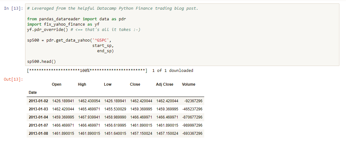
sp500 = pdr.get_data_yahoo('^GSPC',
start_sp,
end_sp)
sp500.head()
If you’re following along with your own notebook, you should see something like the below once you’ve successfully read in the data from Yahoo’s API:
After loading in the S&P 500 data, you’ll see that I inspect the head and tail of the dataframe, as well as condense the dataframe to only include the Adj Close column. The difference between the Adjusted Close and the Close columns is that an adjusted close reflects dividends (see future areas for development below). When a company issues a dividend, the share price is reduced by the size of the dividend per share, as the company is distributing a portion of the company’s earnings. For purposes of this analysis, you will only need to analyze this column. I also create a dataframe which only includes the S&P’s adjusted close on the last day of 2017 (start of 2018); this is in order to run YTD comparisons of individual tickers relative to the S&P 500’s performance.
In the below code, you create an array of all of the tickers in our sample portfolio dataframe. You then write a function to read in all of the tickers and their relevant data into a new dataframe, which is essentially the same approach you took for the S&P500 but applied to all of the portfolio’s tickers.
# Generate a dynamic list of tickers to pull from Yahoo Finance API based on the imported file with tickers.
tickers = portfolio_df['Ticker'].unique()
tickers

# Stock comparison code

def get(tickers, startdate, enddate):
    def data(ticker):
        return (pdr.get_data_yahoo(ticker, start=startdate, end=enddate))
    datas = map(data, tickers)
    return(pd.concat(datas, keys=tickers, names=['Ticker', 'Date']))

all_data = get(tickers, stocks_start, stocks_end)
As with the S&P 500 dataframe, you’ll create an adj_close dataframe which only has the Adj Close column for all of your stock tickers. If you look at the notebook in the repo I link to above, this code is chunked out in more code blocks than shown below. For purposes of describing this here, I’ve included below all of the code which leads up to our initial merged_portfolio dataframe.
# Also only pulling the ticker, date and adj. close columns for our tickers.
adj_close = all_data[['Adj Close']].reset_index()
adj_close.head()
# Grabbing the ticker close from the end of last year
adj_close_start = adj_close[adj_close['Date']==end_of_last_year]
adj_close_start.head()
# Grab the latest stock close price
adj_close_latest = adj_close[adj_close['Date']==stocks_end]
adj_close_latest
adj_close_latest.set_index('Ticker', inplace=True)
adj_close_latest.head()
# Set portfolio index prior to merging with the adj close latest.
portfolio_df.set_index(['Ticker'], inplace=True)
portfolio_df.head()
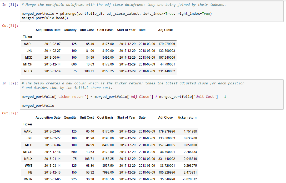
# Merge the portfolio dataframe with the adj close dataframe; they are being joined by their indexes.
merged_portfolio = pd.merge(portfolio_df, adj_close_latest, left_index=True, right_index=True)
merged_portfolio.head()
# The below creates a new column which is the ticker return; takes the latest adjusted close for each position
# and divides that by the initial share cost.
merged_portfolio['ticker return'] = merged_portfolio['Adj Close'] / merged_portfolio['Unit Cost'] - 1
merged_portfolio
Depending on your level of familiarity with pandas, this will be very straightforward to slightly overwhelming. Below, I’ll unpack what these lines are doing:
- The overall approach you are taking is an example of split-apply-combine (note this downloads a PDF).
- The
all_data[['Adj Close']]line creates a new dataframe with only the columns provided in the list; hereAdj Closeis the only item provided in the list. - Using this line of code,
adj_close[adj_close['Date']==end_of_last_year], you are filtering theadj_closedataframe to only the row where the data’sDatecolumn equals the date which you earlier specified in theend_of_last_yearvariable (2017, 12, 29). - You also set the index of the
adj_close_latestandportfolio_dfdataframes. I did this because this is how you’ll merge the two dataframes. Themergefunction, very similar to SQL joins, is an extremely useful function which I use very often. - Within the
mergefunction, you specify the left dataframe (portfolio_df) and our right dataframe (adj_close_latest). By specifyingleft_indexandright_indexequal True, you are stating that the two dataframes share a common index and you will join both on this. - Last, you create a new column called
'ticker return'. This calculates the percent return for each stock position by dividing theAdj Closeby theUnit Cost(initial purchase price for stock) and subtracting 1. This is similar to calculating a formula in excel and carrying it down, but inpandasthis is accomplished with one-line of code.
You have taken the individual dataframes for the S&P 500 and individual stocks, and you are beginning to develop a ‘master’ dataframe which we’ll use for calculations, visualizations and any further analysis. Next, you continue to build on this ‘master’ dataframe with further use of pandas merge function. Below, you reset the current dataframe’s index and begin joining your smaller dataframes with the master one. Once again, the below code block is broken out further in the Jupyter notebook; here I take a similar approach to before where I’ll share the code below and then break down the key callouts below the code block.
merged_portfolio.reset_index(inplace=True)

# Here we are merging the new dataframe with the sp500 adjusted closes since the sp start price based on
# each ticker's acquisition date and sp500 close date.

merged_portfolio_sp = pd.merge(merged_portfolio, sp_500_adj_close, left_on='Acquisition Date', right_on='Date')
# .set_index('Ticker')

# We will delete the additional date column which is created from this merge.
# We then rename columns to Latest Date and then reflect Ticker Adj Close and SP 500 Initial Close.

del merged_portfolio_sp['Date_y']

merged_portfolio_sp.rename(columns={'Date_x': 'Latest Date', 'Adj Close_x': 'Ticker Adj Close'
                                    , 'Adj Close_y': 'SP 500 Initial Close'}, inplace=True)

# This new column determines what SP 500 equivalent purchase would have been at purchase date of stock.
merged_portfolio_sp['Equiv SP Shares'] = merged_portfolio_sp['Cost Basis'] / merged_portfolio_sp['SP 500 Initial Close']
merged_portfolio_sp.head()

# We are joining the developing dataframe with the sp500 closes again, this time with the latest close for SP.
merged_portfolio_sp_latest = pd.merge(merged_portfolio_sp, sp_500_adj_close, left_on='Latest Date', right_on='Date')

# Once again need to delete the new Date column added as it's redundant to Latest Date.
# Modify Adj Close from the sp dataframe to distinguish it by calling it the SP 500 Latest Close.

del merged_portfolio_sp_latest['Date']

merged_portfolio_sp_latest.rename(columns={'Adj Close': 'SP 500 Latest Close'}, inplace=True)

merged_portfolio_sp_latest.head()
- You use
reset_indexon themerged_portfolioin order to flatten the master dataframe and join on the smaller dataframes’ relevant columns. - In the
merged_portfolio_spline, you merge the current master dataframe (merged_portfolio) with thesp_500_adj_close; you do this in order to have the S&P’s closing price on each position’s purchase date – this allows you to track the S&P performance over the same time period that each position is held (from acquisition date to most recent market close date). - The merge here is slightly different than before, in that we join on the left dataframe’s
Acquisition Datecolumn and on the right dataframe’sDatecolumn. - After completing this merge, you will have extra columns which you do not need – since our master dataframe will eventually have a considerable number of columns for analysis, it is important to prune duplicative and unnecessary columns along the way.
- There are several ways to remove unnecessary columns and perform various column name cleanups; for simplicity, I use
pythondeland then rename a few columns with pandasrenamemethod, clarifying the ticker’sAdj Closecolumn by renaming toTicker Adj Close; and you distinguish the S&P’s initial adjusted close withSP 500 Initial Close. - When you calculate
merged_portfolio_sp['Equiv SP Shares'], you do so in order to be able to calculate the S&P 500’s equivalent value for the close on the date you acquired each ticker position: if you spend $5,000 on a new stock position, you could have spent $5,000 on the S&P 500; continuing the example, if the S&P 500 was trading at $2,500 per share at the time of purchase, you would have been able to purchase 2 shares. Later, if the S&P 500 is trading for $3,000 per share, your stake would be worth $6,000 (2 equivalent shares * $3,000 per share) and you would have $1,000 in paper profits over this comparable time period. - In the rest of the code block, you next perform a similar merge, this time joining on the S&P 500’s latest close – this provides the second piece needed to calculate the S&P’s comparable return relative to each position’s holding period: the S&P 500 price on each ticker’s acquisition day and the S&P 500’s latest market close.
You have now further developed your ‘master’ dataframe with the following:
- Each portfolio position’s price, shares and value on the position acquisition day, as well as the latest market’s closing price.
- An equivalent S&P 500 price, shares and value on the equivalent position acquisition day for each ticker, as well as the latest S&P 500 closing price.
Given the above, you will next perform the requisite calculations in order to compare each position’s performance, as well as the overall performance of this strategy / basket of stocks, relative to comparable dollar investment and holding times of the S&P 500.
Below is a summary of the new columns which you are adding to the ‘master’ dataframe.
- In the first column,
['SP Return'], you create a column which calculates the absolute percent return of the S&P 500 over the holding period of each position (note, this is an absolute return and is not an annualized return). In the second column (['Abs. Return Compare']), you compare the['ticker return'](each position’s return) relative to the['SP Return']over the same time period. - In the next three columns,
['Ticker Share Value'],['SP 500 Value']and['Abs Value Compare'], we calculate the dollar value (market value) equivalent based on the shares we hold multiplied by the latest adjusted close price (and subtract the S&P return from the ticker to calculate over / (under) performance). - Last, the
['Stock Gain / (Loss)']and['SP 500 Gain / (Loss)']columns calculate our unrealized dollar gain / loss on each position and comparable S&P 500 gain / loss; this allows us to compare the value impact of each position versus simply investing those dollars in the S&P 500.
# Percent return of SP from acquisition date of position through latest trading day.
merged_portfolio_sp_latest['SP Return'] = merged_portfolio_sp_latest['SP 500 Latest Close'] / merged_portfolio_sp_latest['SP 500 Initial Close'] - 1

# This is a new column which takes the tickers return and subtracts the sp 500 equivalent range return.
merged_portfolio_sp_latest['Abs. Return Compare'] = merged_portfolio_sp_latest['ticker return'] - merged_portfolio_sp_latest['SP Return']

# This is a new column where we calculate the ticker's share value by multiplying the original quantity by the latest close.
merged_portfolio_sp_latest['Ticker Share Value'] = merged_portfolio_sp_latest['Quantity'] * merged_portfolio_sp_latest['Ticker Adj Close']

# We calculate the equivalent SP 500 Value if we take the original SP shares * the latest SP 500 share price.
merged_portfolio_sp_latest['SP 500 Value'] = merged_portfolio_sp_latest['Equiv SP Shares'] * merged_portfolio_sp_latest['SP 500 Latest Close']

# This is a new column where we take the current market value for the shares and subtract the SP 500 value.
merged_portfolio_sp_latest['Abs Value Compare'] = merged_portfolio_sp_latest['Ticker Share Value'] - merged_portfolio_sp_latest['SP 500 Value']

# This column calculates profit / loss for stock position.
merged_portfolio_sp_latest['Stock Gain / (Loss)'] = merged_portfolio_sp_latest['Ticker Share Value'] - merged_portfolio_sp_latest['Cost Basis']

# This column calculates profit / loss for SP 500.
merged_portfolio_sp_latest['SP 500 Gain / (Loss)'] = merged_portfolio_sp_latest['SP 500 Value'] - merged_portfolio_sp_latest['Cost Basis']

merged_portfolio_sp_latest.head()
You now have what you need in order to compare your portfolio’s performance to a portfolio equally invested in the S&P 500. The next two code block sections allow you to i) compare YTD performance of each position relative to the S&P 500 (a measure of momentum and how your positions are pacing) and ii) compare the most recent closing price for each portfolio position relative to its most recent closing high (this allows you to assess if a position has triggered a trailing stop, e.g., closed 25% below closing high).
Below, I’ll start with the YTD performance code block and provide details regarding the code further below.
# Merge the overall dataframe with the adj close start of year dataframe for YTD tracking of tickers.

merged_portfolio_sp_latest_YTD = pd.merge(merged_portfolio_sp_latest, adj_close_start, on='Ticker')
# , how='outer'

# Deleting date again as it's an unnecessary column.  Explaining that new column is the Ticker Start of Year Close.

del merged_portfolio_sp_latest_YTD['Date']

merged_portfolio_sp_latest_YTD.rename(columns={'Adj Close': 'Ticker Start Year Close'}, inplace=True)

# Join the SP 500 start of year with current dataframe for SP 500 ytd comparisons to tickers.

merged_portfolio_sp_latest_YTD_sp = pd.merge(merged_portfolio_sp_latest_YTD, sp_500_adj_close_start
                                             , left_on='Start of Year', right_on='Date')

# Deleting another unneeded Date column.

del merged_portfolio_sp_latest_YTD_sp['Date']

# Renaming so that it's clear this column is SP 500 start of year close.
merged_portfolio_sp_latest_YTD_sp.rename(columns={'Adj Close': 'SP Start Year Close'}, inplace=True)

# YTD return for portfolio position.
merged_portfolio_sp_latest_YTD_sp['Share YTD'] = merged_portfolio_sp_latest_YTD_sp['Ticker Adj Close'] / merged_portfolio_sp_latest_YTD_sp['Ticker Start Year Close'] - 1

# YTD return for SP to run compares.
merged_portfolio_sp_latest_YTD_sp['SP 500 YTD'] = merged_portfolio_sp_latest_YTD_sp['SP 500 Latest Close'] / merged_portfolio_sp_latest_YTD_sp['SP Start Year Close'] - 1
- When creating the
merged_portfolio_sp_latest_YTDdataframe, you are now merging the ‘master’ dataframe with theadj_close_startdataframe; as a quick reminder, you created this dataframe by filtering on theadj_closedataframe where the'Date'column equaled the variableend_of_last_year; you do this because it’s how YTD (year-to-date) stock and index performances are measured; last year’s ending close is the following year’s starting price. - From here, we once again use
delto remove unnecessary columns and therenamemethod to clarify the ‘master’ dataframe’s newly added columns. - Last, we take each Ticker (in the
['Ticker Adj Close']column) and calculate the YTD return for each (we also have an S&P 500 equivalent value for each value in the'SP 500 Latest Close'column).
In the below code block, you use the sort_values method to re-sort our ‘master’ dataframe and then you calculate cumulative portfolio investments (sum of your position acquisition costs), as well the cumulative value of portfolio positions and the cumulative value of the theoretical S&P 500 investments. This allows you to be able to see how your total portfolio, with investments in positions made at different times across the entire period, compares overall to a strategy where you had simply invested in an index. Later on, you’ll use the ['Cum Ticker ROI Mult'] to help you visualize how much each investment contributed to or decreased your overall return on investment (ROI).
merged_portfolio_sp_latest_YTD_sp = merged_portfolio_sp_latest_YTD_sp.sort_values(by='Ticker', ascending=True)

# Cumulative sum of original investment
merged_portfolio_sp_latest_YTD_sp['Cum Invst'] = merged_portfolio_sp_latest_YTD_sp['Cost Basis'].cumsum()

# Cumulative sum of Ticker Share Value (latest FMV based on initial quantity purchased).
merged_portfolio_sp_latest_YTD_sp['Cum Ticker Returns'] = merged_portfolio_sp_latest_YTD_sp['Ticker Share Value'].cumsum()

# Cumulative sum of SP Share Value (latest FMV driven off of initial SP equiv purchase).
merged_portfolio_sp_latest_YTD_sp['Cum SP Returns'] = merged_portfolio_sp_latest_YTD_sp['SP 500 Value'].cumsum()

# Cumulative CoC multiple return for stock investments
merged_portfolio_sp_latest_YTD_sp['Cum Ticker ROI Mult'] = merged_portfolio_sp_latest_YTD_sp['Cum Ticker Returns'] / merged_portfolio_sp_latest_YTD_sp['Cum Invst']

merged_portfolio_sp_latest_YTD_sp.head()
You are now nearing the home stretch and almost ready to start visualizing your data and assessing the strengths and weaknesses of your portfolio’s individual ticker and overall strategy performance.
As before, I’ve included the main code block for determining where positions are trading relative to their recent closing high; I’ll then unpack the code further below.
# Need to factor in that some positions were purchased much more recently than others.
# Join adj_close dataframe with portfolio in order to have acquisition date.

portfolio_df.reset_index(inplace=True)

adj_close_acq_date = pd.merge(adj_close, portfolio_df, on='Ticker')

# delete_columns = ['Quantity', 'Unit Cost', 'Cost Basis', 'Start of Year']

del adj_close_acq_date['Quantity']
del adj_close_acq_date['Unit Cost']
del adj_close_acq_date['Cost Basis']
del adj_close_acq_date['Start of Year']

# Sort by these columns in this order in order to make it clearer where compare for each position should begin.
adj_close_acq_date.sort_values(by=['Ticker', 'Acquisition Date', 'Date'], ascending=[True, True, True], inplace=True)

# Anything less than 0 means that the stock close was prior to acquisition.
adj_close_acq_date['Date Delta'] = adj_close_acq_date['Date'] - adj_close_acq_date['Acquisition Date']

adj_close_acq_date['Date Delta'] = adj_close_acq_date[['Date Delta']].apply(pd.to_numeric)

# Modified the dataframe being evaluated to look at highest close which occurred after Acquisition Date (aka, not prior to purchase).

adj_close_acq_date_modified = adj_close_acq_date[adj_close_acq_date['Date Delta']>=0]

# This pivot table will index on the Ticker and Acquisition Date, and find the max adjusted close.

adj_close_pivot = adj_close_acq_date_modified.pivot_table(index=['Ticker', 'Acquisition Date'], values='Adj Close', aggfunc=np.max)

adj_close_pivot.reset_index(inplace=True)

# Merge the adj close pivot table with the adj_close table in order to grab the date of the Adj Close High (good to know).

adj_close_pivot_merged = pd.merge(adj_close_pivot, adj_close
                                             , on=['Ticker', 'Adj Close'])

# Merge the Adj Close pivot table with the master dataframe to have the closing high since you have owned the stock.

merged_portfolio_sp_latest_YTD_sp_closing_high = pd.merge(merged_portfolio_sp_latest_YTD_sp, adj_close_pivot_merged
                                             , on=['Ticker', 'Acquisition Date'])

# Renaming so that it's clear that the new columns are closing high and closing high date.
merged_portfolio_sp_latest_YTD_sp_closing_high.rename(columns={'Adj Close': 'Closing High Adj Close', 'Date': 'Closing High Adj Close Date'}, inplace=True)

merged_portfolio_sp_latest_YTD_sp_closing_high['Pct off High'] = merged_portfolio_sp_latest_YTD_sp_closing_high['Ticker Adj Close'] / merged_portfolio_sp_latest_YTD_sp_closing_high['Closing High Adj Close'] - 1

merged_portfolio_sp_latest_YTD_sp_closing_high
- To begin, you merge the
adj_closedataframe with theportfolio_dfdataframe; this is the third time that you’ve leveraged thisadj_closedataframe in order to conduct an isolated analysis which you’ll then combine with the overall ‘master’ dataframe. - This initial merge is not particularly useful, as you have dates and adjusted close prices which pre-date your acquisition date for each position; as a result, we’ll subset the data post our acquisition date, and then find the
maxclosing price since that time. - Once again, I used
delto delete the merged dataframe’s unneeded columns; this is code I should refactor, as creating a list, e.g.,cols_to_keep, and then filtering the dataframe with this would be a better approach – as an FYI, running thedelcode block more than once will throw an error and you would need to re-initialize your dataframe then run thedelcode block again. - After removing the unnecessary columns, you then use the
sort_valuesmethod and sort the values by the'Ticker','Acquisition Date', and'Date'columns (all ascending); you do this to make sure all of the ticker rows are sorted together, and we sort by Acquisition Date (in case we’ve purchased the same stock more than once) and Date ascending in order to filter out the dates prior to your positions’ acquisition dates. In other words, you are only concerned with the closing high since you’ve held the position. - In order to filter our dataframe, you create a new column
['Date Delta']which is calculated by the difference between the Date and Acquisition Date columns. - You then convert this column into a numeric column, and you create a new dataframe called
adj_close_acq_date_modifiedwhere the['Date Delta']is >= 0. This ensures that you are only evaluating closing highs since the date that you purchased each position. - Now that you have the
adj_close_acq_date_modifieddataframe, we’ll use a very powerful pandas function calledpivot_table. If you’re familiar with pivot tables in Excel, this function is similar in that you can pivot data based on a single or multi-index, specify values to calculate and columns to pivot on, and also useagg functions(which leveragenumpy). - Using the
pivot_tablefunction, we pivot on Ticker and Acquisition Date and specify that we would like to find the maximum (np.max)Adj Closefor each position; this allows you to compare the recent Adjusted Close for each position relative to this High Adjusted Close. - Now you have an
adj_close_pivotdataframe, and you reset the index and join this once again on theadj_closedataframe. This creates theadj_close_pivot_mergeddataframe, which tells you when you purchased each position and the date on which it hit its closing high since acquisition. - Finally, we will combine our ‘master’ dataframe with this last smaller dataframe,
adj_close_pivot_merged. - After doing so, you are now able to calculate the final column needed,
['Pct off High']. You take the['Ticker Adj Close']and divide it by the['Closing High Adj Close']and subtract 1. Note, that this percentage will always be negative, unless the stock happened to have its highest close (in this case it will be zero) on the most recent trading day evaluated (this is generally a very good sign if it’s the case).
This has been a pretty significant lift, and it’s now time for our long-awaited visualizations. If you’ve continued to follow along in your own notebook, you now have a very rich dataframe with a number of calculated portfolio metrics, as shown in the below:
.png)
Total Return and Cumulative Return Visualizations
For all of these visualizations you’ll use Plotly, which allows you to make D3 charts entirely without code. While I also use Matplotlib and Seaborn, I really value the interactivity of Plotly; and once you are used to it, the syntax becomes fairly straightforward and dynamic charts are easily attainable.
Your first chart below compares each individual position’s total return relative to the S&P 500 (same holding periods for the position and hypothetical investment in the S&P 500). In the below, you’ll see that over their distinct holding periods, 6 of the 8 positions outperformed the S&P. The last two, Twitter (which actually has had a negative return) and Walmart underperformed an equal timed investment in the S&P 500.
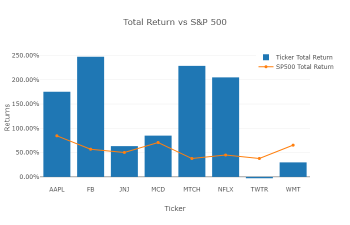
As each of these visualizations are relatively similar, I’ll explain the code required to generate the above Plotly visualization, and for the remaining ones I’ll only summarize observations from each visualization.
trace1 = go.Bar(
    x = merged_portfolio_sp_latest_YTD_sp_closing_high['Ticker'][0:10],
    y = merged_portfolio_sp_latest_YTD_sp_closing_high['ticker return'][0:10],
    name = 'Ticker Total Return')

trace2 = go.Scatter(
    x = merged_portfolio_sp_latest_YTD_sp_closing_high['Ticker'][0:10],
    y = merged_portfolio_sp_latest_YTD_sp_closing_high['SP Return'][0:10],
    name = 'SP500 Total Return')

data = [trace1, trace2]

layout = go.Layout(title = 'Total Return vs S&P 500'
    , barmode = 'group'
    , yaxis=dict(title='Returns', tickformat=".2%")
    , xaxis=dict(title='Ticker')
    , legend=dict(x=.8,y=1)
    )

fig = go.Figure(data=data, layout=layout)
iplot(fig)
- When using
Plotly, you createtraceswhich will plot the x and y data you specify. Here, you specify in trace1 that you want to plot a bar chart, with each Ticker on the x-axis and each ticker’s return on the y-axis. - In trace2, to break up the data a bit, we’ll use a Scatter line chart for the Ticker on the x-axis and the S&P Return on the y-axis.
- Where the bar is above the line, the individual ticker (6 of 8 times) has outperformed the S&P 500.
- You then create a data object with these traces, and then you provide a layout for the chart; in this case you specify a title, barmode, and the position of the legend; you also pass in a title and tick format (percent format to two decimal places) for the y-axis series.
- You then create a figure object using
go.Figure, specifying the data and layout objects, which you previously nameddataandlayout.
The next chart below shows the gain / (loss) dollar amount for each position, relative to the S&P 500, as well as shows the Ticker Total Return %. While it is generally recommended that you allocate an equal position size to your positions (or potentially determine positition sizing based on implied volatility), this may not always be the case. For a less volatile investment, you may invest more than in a riskier position (or you may have other position sizing rules). Given this, this visualization shows both each position’s return and the dollar value contribution to your overall portfolio’s return.
Here, you can see that although you invested slightly less in Facebook (FB) than other positions, this stock has returned an ~$20k in this mock portfolio, greater than a 4x return relative to an equivalent S&P 500 investment over the same holding period.
 Total Return vs S&P 500.png)
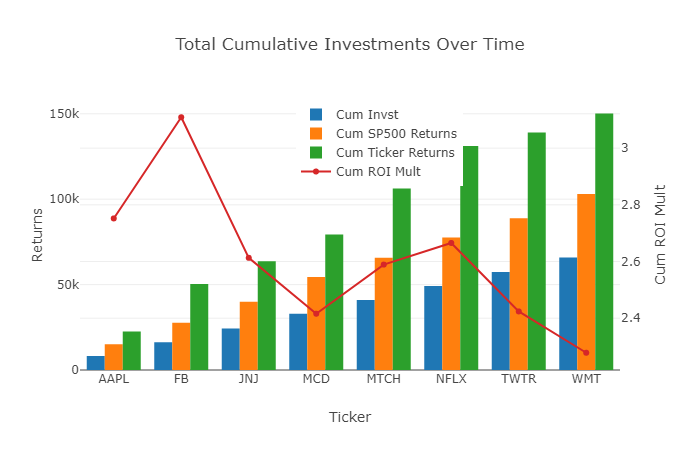
The next chart below leverages the cumulative columns which you created: 'Cum Invst', 'Cum SP Returns', 'Cum Ticker Returns', and 'Cum Ticker ROI Mult'.
- Across the x-axis you have sorted the portfolio alphabetically. Each position shows the initial investment and total value (investment plus returns or less losses) for that position, combined with the positions preceding it.
- To explain further, based on the ~$8k investment in AAPL, this grew to ~$22.5k (>$14k in gains), versus $15k in total value for the S&P. This is a 2.75x return over the initial investment in AAPL ($22.5k value from $8k investment is ~2.75x ROI).
- Continuing to FB, you have invested ~$16k in aggregate ($8k in both positions), and this has grown to over $50k, a greater than 3x total return – this means that FB expanded your overall portfolio ROI.
- Further down the x-axis, you see that both TWTR and WMT have reduced the overall portfolio ROI – this is obvious, as both have underperformed the S&P, but I believe that the magnitude of the contribution is clearer with this visualization.
- As a caveat, this cumulative approach, given the different holding periods, is a bit of an apples and oranges combination for some positions based on when they were acquired. However, you can always isolate this analysis by sub-setting into smaller dataframes and separately compare positions which have more consistent holding periods. For example, you could compare your 2H 2016 and 1H 2017 purchases separate of one another.
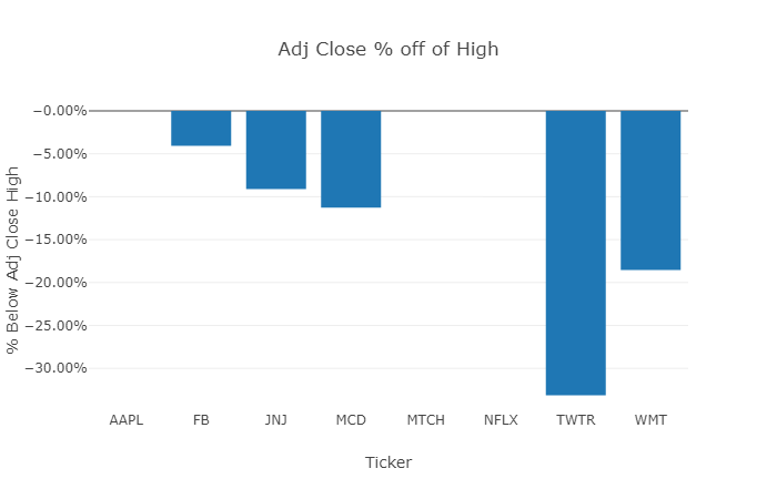
Adjusted Close % off of High Comparison
Your final chart compares how far off each position’s latest close price is from its adjusted closing high since the position was purchased. This is generally an important visualization to consider:
- When a stock closes at higher prices, it’s generally recommended to adjust your trailing stop up as well. To illustrate, here’s an example:
- A position is acquired at $10 and doubles to $20 – using a 25% trailing stop, you would want to consider selling this position the next day if it closed at $15 ($15 / $20 - 1 = (25%)).
- If the position increased to $25, you would want to consider moving your trailing stop up to $18.75 ($18.75 / $25 - 1 = (25%)).
- As mentioned early on, nothing in here is intended to be financial advice; different trading systems have different rules for trailing stops, and this is an illustrative example.
- Trailing stops are meant to help preserve gains and are generally important in mitigating the emotions of investing; while it’s easy to see your position’s current return, what tends to be manual (or somewhat expensive if you use a trailing stop service) is calculating how close your positions are to your trailing stops.
- This final visualization makes this easy to evaluate for any date you are reviewing; in the chart, we see that AAPL, MTCH, and NFLX all closed on 3/9/2018 at their closing highs (typically a very good sign).
- However, TWTR is greater than 25% below its highest close (33% below as of 3/9/2018) and WMT is ~20% below its highest close.
- In this case, you might want to sell TWTR and continue to keep a close eye on the performance of WMT.
Limitations to Approach and Closing Summary
Now you have a relatively extensible Jupyter notebook and portfolio dataset, which you are able to use to evaluate your stock portfolio, as well as add in new metrics and visualizations as you see fit.
Please note that while this notebook provides a fairly thorough review of a portfolio, the below have not yet been taken into consideration, would have an impact on the overall comparison, and likely present great areas for future development:
- As noted initially, this notebook focuses on active holdings – ideally, we would evaluate all positions, both exited and active, in order to have a truly holistic view on one’s investment strategy relative to alternatives, such as an index comparison.
- The approach in here does not factor in dividends; while we evaluate adjusted close prices (which reflect dividends), total shareholder return combines share price appreciation and dividends to show a stock’s total return; while this is more difficult to do, it is something I’m evaluating to include in the future.
- On a related note, investors can also reinvest dividends in a position, rather than take a cash distribution; this is arguably even more complicated than accounting for dividends, as the acquisition costs are low and spread out, and over several years of holding a position you could have four (or more) acquisition dates each year for stocks where you reinvest dividends.
With those future areas in mind, we accomplished a lot here; this includes importing S&P 500 and ticker data using Yahoo! Finance’s API and creating a master dataframe which combines your portfolio with historical ticker and comparative S&P 500 prices. In doing this, you are able to calculate the absolute percent and dollar value returns for each position (and as compared to equally timed S&P 500 investments), as well as the cumulative impact of each position on your overall portfolio’s performance. You can also dynamically monitor your trailing stops, based on your own trading rules. And you have created visualizations which allow you to have much better insight into your master dataframe, focusing on the different metrics and each position’s contribution to each.
I hope that you found this tutorial useful, and I welcome any feedback in the comments. Feel free to also reach out to me on twitter, @kevinboller, and my personal blog can be found here.